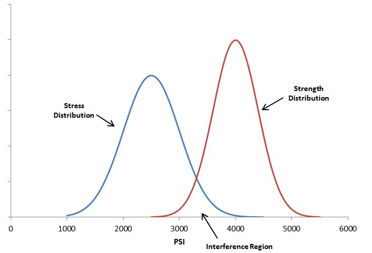
Whether you are building bridges, baseball bats, or medical devices, one of the most basic rules of engineering is that the thing you build must be strong enough to survive its service environment. Although a simple concept in principle, variation in use conditions, material properties, and geometric tolerances all introduce uncertainty that can doom a product. Stress-Strength analysis attempts to formalize a more rigorous approach to evaluating overlap between the stress and strength distributions. Graphically, a smaller area of overlap represents a smaller probability of failure and greater expected reliability (although it doesn’t exactly equal the probability of failure).1 2
However, even formal stress-strength analysis usually infers device reliability from point estimates of material strength and/or use conditions. Monte Carlo simulations intending to respect the full spread of stress and strength distributions generally ignore the uncertainty inherent in the distributional parameters themselves. Fortunately there is a Bayesian extension of Stress-Strength analysis that naturally incorporates the uncertainty of the parameters to provide a true probability distribution of device reliability. In this post I will first walk through the frequentist approach to obtaining a point estimate of reliability and then the Bayesian extension that yields a full posterior for reliability.
First, load the libraries.
library(tidyverse)
library(broom)
library(survival)
library(brms)
library(knitr)
library(patchwork)
library(tidybayes)
library(gganimate)
library(transformr)
I’ll be using a dataset from Liu and Abeyratne that contains stress and strength data for an electrode connector component in an electronic medical device.3 The stress-in-service data are compiled from characterization tests and customer usage data. The strength data (here called “failure_stress” to emphasize that they can be directly evaluated against stress-in-service) are obtained from benchtop testing and are right censored at 15. Assume the units of each are the same.
The stress-in-service data are known from historical testing to follow a lognormal distribution. Likewise, the failure stress data are known to follow a Weibull distribution.
# Manually enter data
stress_in_service_tbl <- tibble(stress_in_service = c(2.53, 2.76, 1.89, 3.85, 3.62, 3.89, 3.06, 2.16, 2.20, 1.90, 1.96, 2.09, 1.70, 5.77, 4.35, 5.30, 3.61, 2.63, 4.53, 4.77, 1.68, 1.85, 2.32, 2.11, 1.94, 1.81, 1.53, 1.60, 0.47, 1.06, 1.30, 2.84, 3.84, 3.32))

# Peek at data
stress_in_service_tbl %>%
  head(7) %>%
kable(align = "c")| stress_in_service |
|---|
| 2.53 |
| 2.76 |
| 1.89 |
| 3.85 |
| 3.62 |
| 3.89 |
| 3.06 |
# manually enter failure stress data
failure_stress_tbl <- tibble(failure_stress = c(7.52, 15, 8.44, 6.67, 11.48, 11.09, 15, 5.85, 13.27, 13.09, 12.73, 11.08, 15, 8.41, 12.34, 8.77, 6.47, 10.51, 7.05, 10.90, 12.38, 7.78, 14.61, 15, 10.99, 11.35, 4.72, 6.72, 11.74, 8.45, 13.26, 13.89, 12.83, 6.49))

# add column to indicate run-out / censoring.  brms convention is 1 = censored, 0 = failure event
failure_stress_tbl <- failure_stress_tbl %>%
  mutate(censored_brms = case_when(failure_stress == 15 ~ 1, TRUE ~ 0)) %>%
  mutate(censored_surv = case_when(failure_stress == 15 ~ 0,TRUE ~ 1))

# peek at data
failure_stress_tbl %>%
  head(7) %>%
kable(align = rep("c", 3))| failure_stress | censored_brms | censored_surv |
|---|---|---|
| 7.52 | 0 | 1 |
| 15.00 | 1 | 0 |
| 8.44 | 0 | 1 |
| 6.67 | 0 | 1 |
| 11.48 | 0 | 1 |
| 11.09 | 0 | 1 |
| 15.00 | 1 | 0 |
After verifying the data has been imported correctly, the two distributions can be visualized on the same plot and the degree of overlap evaluated qualitatively.
# set up a combined stress/strength tibble
a <- tibble(val = stress_in_service_tbl$stress_in_service, label = "stress_in_service")
b <- tibble(val = failure_stress_tbl$failure_stress, label = "failure_stress")
overlap_tbl <- bind_rows(a, b) %>%
  mutate(label = as_factor(label))

# view combined tbl
overlap_tbl %>%
  head(5) %>%
kable(align = rep("c", 2))| val | label |
|---|---|
| 2.53 | stress_in_service |
| 2.76 | stress_in_service |
| 1.89 | stress_in_service |
| 3.85 | stress_in_service |
| 3.62 | stress_in_service |
overlap_tbl %>%
  tail(5) %>%
kable(align = rep("c", 2))| val | label |
|---|---|
| 8.45 | failure_stress |
| 13.26 | failure_stress |
| 13.89 | failure_stress |
| 12.83 | failure_stress |
| 6.49 | failure_stress |
# plot empirical distributions
overlap_tbl %>% ggplot() +
  geom_density(aes(x = val, fill = label), alpha = .5) +
  labs(
    x = "Stress",
    y = "Density of Observations",
    title = "Empirical Distributions for Stress-In-Service and Failure Stress",
    subtitle = "Overlap Region Represents Posssible Device Failure, Failrue Stress Censored at 15"
  ) +
  scale_fill_manual(values = c("#20A486FF", "#FDE725FF")) +
  theme(legend.title = element_blank()) +
  theme(legend.position = "bottom")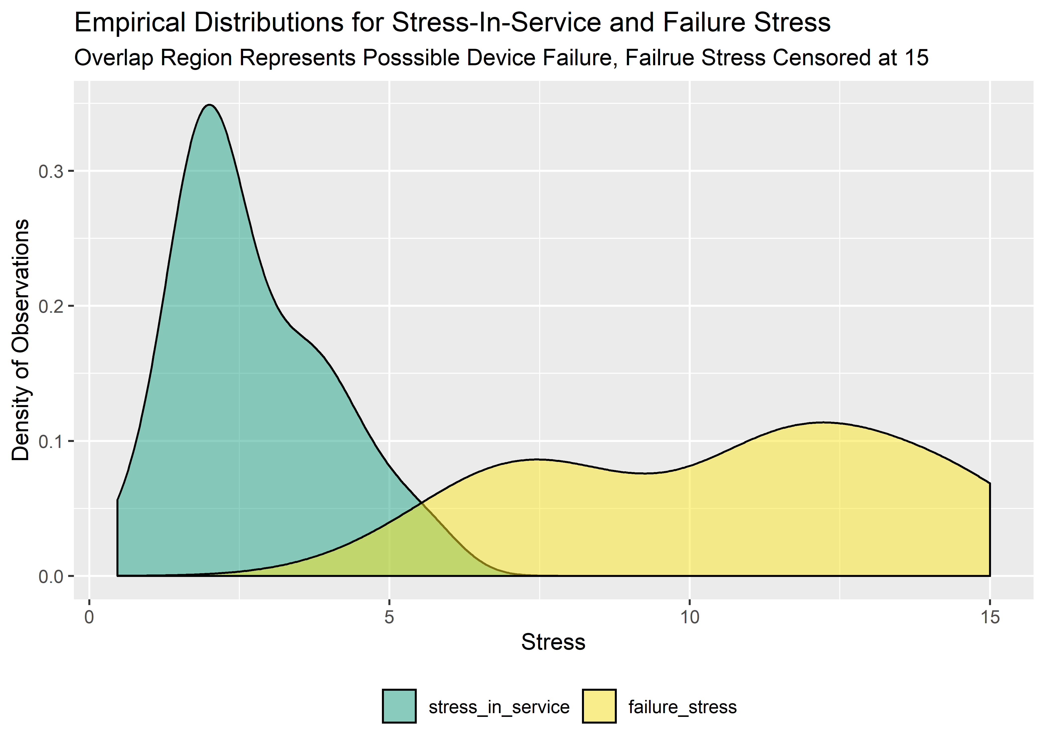
Obtain the Frequentist Point Estimates
We can get the best parameter estimates for both data sets using the survreg function from the survival package.
#fit stress-in-service data using survreg from survival package
stress_in_service_fit <- survreg(Surv(stress_in_service) ~ 1,
  data = stress_in_service_tbl,
  dist = "lognormal"
)

#extract point estimates of parameters from sis-fit
sis_point_est_tbl <- tidy(stress_in_service_fit)[1, 2] %>%
  rename(meanlog = estimate) %>%
  mutate(sdlog = stress_in_service_fit$scale) %>%
  round(2) %>%
  kable(align = rep("c", 2))

sis_point_est_tbl | meanlog | sdlog |
|---|---|
| 0.88 | 0.5 |
#fit failure stress data using survreg from survival package
failure_stress_fit <- survreg(Surv(failure_stress, censored_surv) ~ 1,
  data = failure_stress_tbl,
  dist = "weibull"
)

# extract scale parameter
scale <- tidy(failure_stress_fit)[1, 2] %>%
  rename(scale = estimate) %>%
  exp() %>%
  round(2)

# extract shape parameter
shape <- tidy(failure_stress_fit)[2, 2] %>%
  rename(shape = estimate) %>%
  exp() %>%
  .^-1 %>%
  round(2)

# summarize
fs_point_est_tbl <- bind_cols(shape, scale) %>%
  kable(align = rep("c", 2))

fs_point_est_tbl| shape | scale |
|---|---|
| 3.57 | 12 |
The reliability point estimate is obtained by drawing randomly from the two fitted distributions and seeing the percentage of occasions where the stress_in_service is greater than the failure_stress:
# Monte Carlo to see how often s-i-s > fs
set.seed(10)

#random draws
sis_draws <- rlnorm(n = 100000, meanlog = .88, sdlog = .50)
fs_draws <- rweibull(n = 100000, shape = 3.57, scale = 12)

#assign 1 to cases where sis_draws >= fs_draws
point_sim <- tibble(
  sis_draws = sis_draws,
  fs_draws = fs_draws
) %>%
  mutate(freq = case_when(
    sis_draws >= fs_draws ~ 1,
    TRUE ~ 0
  ))

#take freqency of 0's
reliability_pt_est <- (1 - mean(point_sim$freq))

#show as tibble
tibble(reliability = 1 - mean(point_sim$freq)) %>%
  round(3) %>%
kable(align = "c")| reliability |
|---|
| 0.986 |
Model the Stress-in-Service with brms
For the Bayesian approach we fit the models with brms instead of survreg. The result is a posterior of plausible values for each parameter.
Before running to model, reasonable priors were established through simulation. Code and details are included in the Appendix at the end of this post so as to not derail the flow.
#Fit model to stress-in-service data. Data is known to be of lognormal form.

# stress_in_service_model_1 <-
#  brm(
#    data = stress_in_service_tbl, family = lognormal,
#    stress_in_service ~ 1,
#   prior = c(
#     prior(normal(.5, 1), class = Intercept),
#     prior(uniform(.01, 8), class = sigma)),
#   iter = 41000, warmup = 40000, chains = 4, cores = 4,
#   seed = 4
# )
Clean up the posterior tibble and plot.
# extract posterior draws
post_samples_stress_in_service_model_1_tbl <-
  posterior_samples(stress_in_service_model_1) %>%
  select(-lp__) %>%
  rename("mu" = b_Intercept)

#examine as tibble
post_samples_stress_in_service_model_1_tbl %>%
  head(7) %>%
kable(align = rep("c", 2), digits = 3)| mu | sigma |
|---|---|
| 0.932 | 0.537 |
| 0.922 | 0.601 |
| 0.801 | 0.535 |
| 0.836 | 0.526 |
| 0.977 | 0.540 |
| 0.732 | 0.535 |
| 0.757 | 0.535 |
# get visual of posterior with rough idea of chain convergence
plot(stress_in_service_model_1)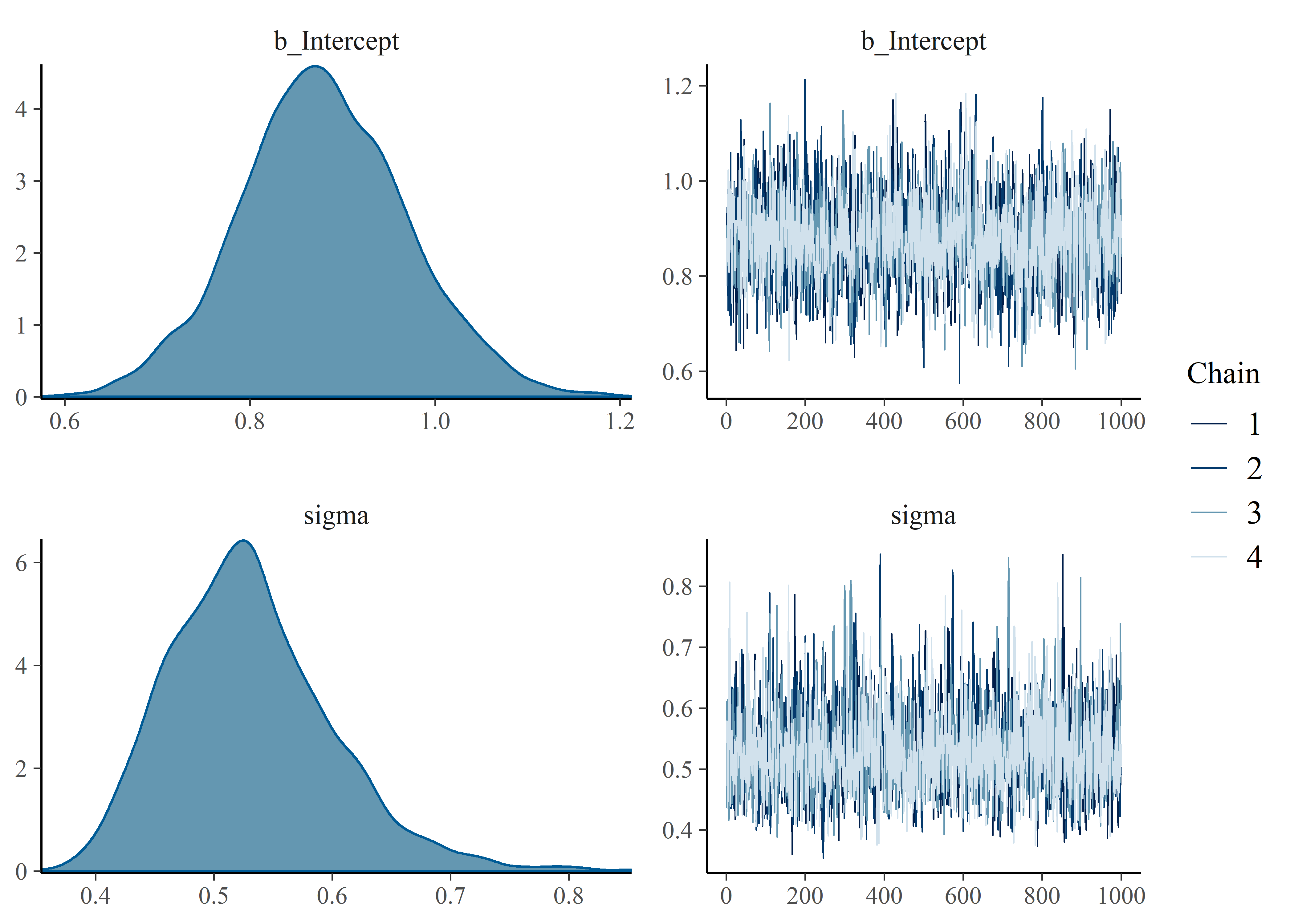
Here is the summary of the stress-in-service model:
# evaluate posterior distribution with 95% CI and rhat diagnostic
summary(stress_in_service_model_1)
## Family: lognormal
## Links: mu = identity; sigma = identity
## Formula: stress_in_service ~ 1
## Data: stress_in_service_tbl (Number of observations: 34)
## Samples: 4 chains, each with iter = 41000; warmup = 40000; thin = 1;
## total post-warmup samples = 4000
##
## Population-Level Effects:
## Estimate Est.Error l-95% CI u-95% CI Rhat Bulk_ESS Tail_ESS
## Intercept 0.88 0.09 0.71 1.06 1.00 1976 2298
##
## Family Specific Parameters:
## Estimate Est.Error l-95% CI u-95% CI Rhat Bulk_ESS Tail_ESS
## sigma 0.53 0.07 0.42 0.69 1.00 2399 2016
##
## Samples were drawn using sampling(NUTS). For each parameter, Eff.Sample
## is a crude measure of effective sample size, and Rhat is the potential
## scale reduction factor on split chains (at convergence, Rhat = 1).Model the Failure Stress Data with brms
The failure stress data is fit in a similar way as before. Again, prior predictive simulations are shown in the Appendix.
# failure_stress_model_1 <- brm(failure_stress | cens(censored_brms) ~ 1,
# data = failure_stress_tbl, family = weibull(),
# prior = c(
#   prior(student_t(3, 5, 5), class = Intercept),
#   prior(uniform(0, 10), class = shape)),
# iter = 41000, warmup = 40000, chains = 4, cores = 4, seed = 4
# )
The following code extracts and converts the parameters from the brms default into the shape and scale that are used in the rweibull() function before displaying the summaries.
# extract posterior draws and examine as tibble
failure_stress_model_1_tbl <-
  posterior_samples(failure_stress_model_1) %>%
  select(-lp__) %>%
  rename("mu" = b_Intercept)

#compute shape and scale
post_samples_failure_stress_model_1_tbl <- posterior_samples(failure_stress_model_1) %>%
  mutate(scale = exp(b_Intercept) / (gamma(1 + 1 / shape))) %>%
  select(shape, scale)

#display as tibble
post_samples_failure_stress_model_1_tbl %>%
  head(7) %>%
kable(align = rep("c", 2), digits = 3)| shape | scale |
|---|---|
| 3.590 | 10.972 |
| 3.502 | 11.126 |
| 3.363 | 10.961 |
| 3.570 | 10.310 |
| 3.040 | 13.621 |
| 3.067 | 13.753 |
| 4.245 | 11.035 |
plot(failure_stress_model_1)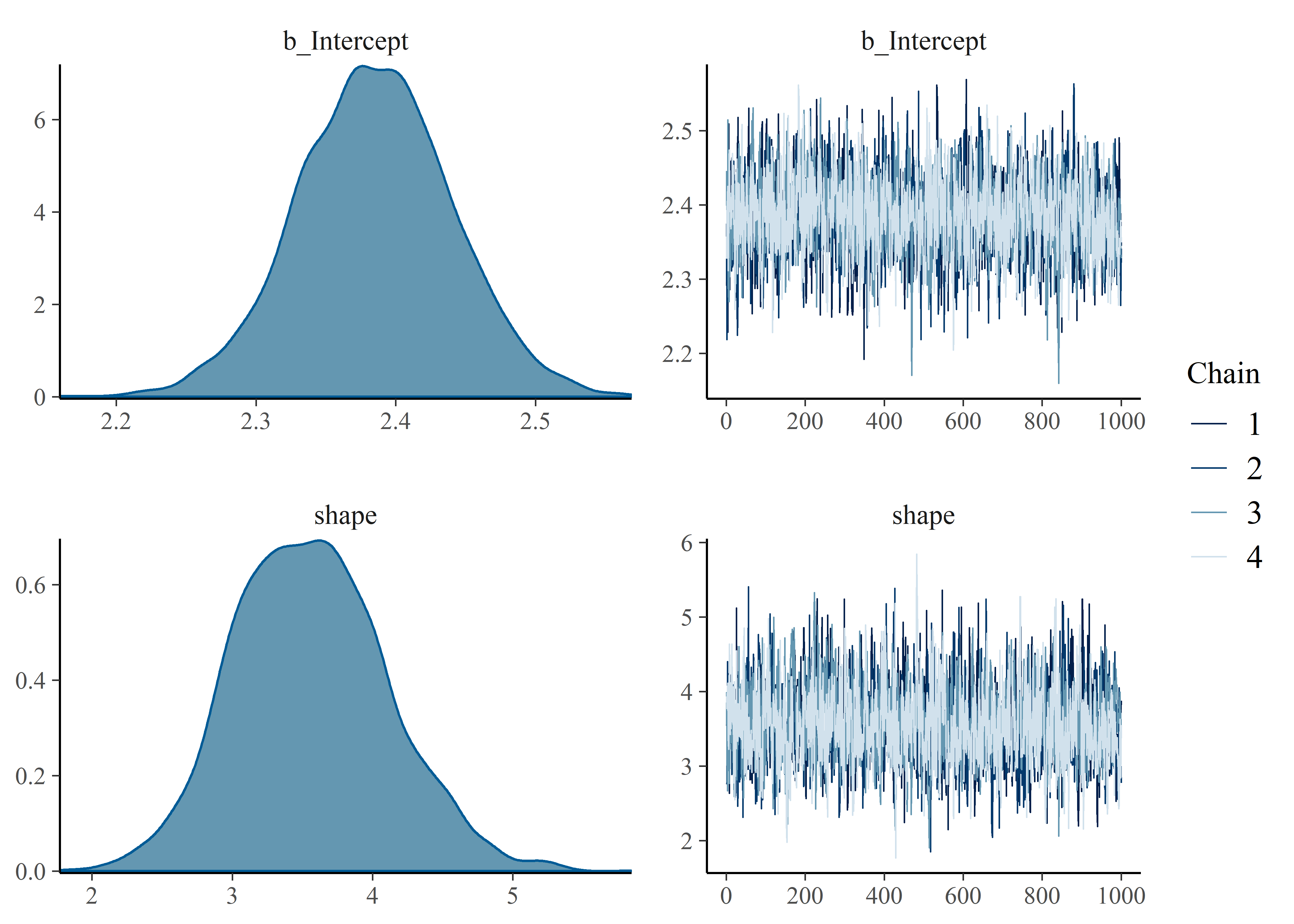
summary(failure_stress_model_1)## Family: weibull
## Links: mu = log; shape = identity
## Formula: failure_stress | cens(censored_brms) ~ 1
## Data: failure_stress_tbl (Number of observations: 34)
## Samples: 4 chains, each with iter = 41000; warmup = 40000; thin = 1;
## total post-warmup samples = 4000
##
## Population-Level Effects:
## Estimate Est.Error l-95% CI u-95% CI Rhat Bulk_ESS Tail_ESS
## Intercept 2.38 0.06 2.28 2.49 1.00 2257 2279
##
## Family Specific Parameters:
## Estimate Est.Error l-95% CI u-95% CI Rhat Bulk_ESS Tail_ESS
## shape 3.56 0.55 2.56 4.67 1.00 1963 2169
##
## Samples were drawn using sampling(NUTS). For each parameter, Eff.Sample
## is a crude measure of effective sample size, and Rhat is the potential
## scale reduction factor on split chains (at convergence, Rhat = 1).Visualization of Uncertainty - Credible Curves for Stress-in-Service and Failure Stress
I haven’t ever used the gganimate package and this seems like a nice opportunity. The code below draws a small handful of parameters from the posterior and plots them to visualize the uncertainty in both distributions.
#take 25 sets of parameters, convert to lnorm curves
lnorm_stress_curve_tbl <- post_samples_stress_in_service_model_1_tbl[1:25, ] %>%
  mutate(plotted_y_data = map2(
    mu, sigma,
    ~ tibble(
      x = seq(0, 20, length.out = 100),
      y = dlnorm(x, .x, .y)
    )
  )) %>%
  unnest(plotted_y_data) %>%
  mutate(model = "Stress in Service [lnorm]") %>%
  rename(
    param_1 = mu,
    param_2 = sigma
  )

#take 25 sets of parameters, convert to Weib curves
weib_stress_curve_tbl <- post_samples_failure_stress_model_1_tbl[1:25, ] %>%
  mutate(plotted_y_data = map2(
    shape, scale,
    ~ tibble(
      x = seq(0, 20, length.out = 100),
      y = dweibull(x, .x, .y)
    )
  )) %>%
  unnest(plotted_y_data) %>%
  mutate(model = "Failure Stress [weib]") %>%
  rename(
    param_1 = shape,
    param_2 = scale
  )

#combine
a <- bind_rows(lnorm_stress_curve_tbl, weib_stress_curve_tbl) %>% mutate(param_1_fct = as_factor(param_1))

#visualize
p <- a %>%
  ggplot(aes(x, y)) +
  geom_line(aes(x, y, group = param_1_fct, color = model), alpha = 1, size = 1) +
  labs(
    x = "Stress",
    y = "Density",
    title = "Credible Failure Stress and Service Stress Distributions",
    subtitle = "n=25 curves sampled from the posterior"
  ) +
  scale_color_viridis_d(end = .8) +
  guides(colour = guide_legend(override.aes = list(alpha = 1))) +
  theme(legend.title = element_blank()) +
  theme(legend.position = "bottom") +
  transition_states(param_1_fct, 0, 1) +
  shadow_mark(past = TRUE, future = TRUE, alpha = .3, color = "gray50", size = .4)

#gganimate
animate(p, nframes = 50, fps = 2.5, width = 900, height = 600, res = 120, dev = "png", type = "cairo")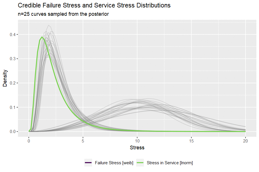
Building the Credible Reliability Distribution
Having now obtained the posterior distributions for both stress-in-service and failure stress, we can select random sets of parameters and compare a random (but credible) pair of distributions. By simulating from each random pair of distributions and calculating a single value of reliability as before, we can build out a credible reliability distribution. The blue vertical line indicates the frequentist point estimate we obtained at the beginning of the analysis.
#set number of simulations
n_sims <- 10000
set.seed(1001)

#stress-in-service (lognormal) simulations
labeled_post_ln_tbl <- post_samples_stress_in_service_model_1_tbl %>%
  mutate(
    model = "lognormal"
  ) %>%
  rename(
    param1 = mu,
    param2 = sigma
  ) %>%
  mutate(nested_data_ln = map2(param1, param2, ~ rlnorm(n_sims, .x, .y)))

#failure stress (Weibull) simulations
labeled_post_wb_tbl <- post_samples_failure_stress_model_1_tbl %>%
  mutate(
    model = "weibull"
  ) %>%
  rename(
    param1 = shape,
    param2 = scale
  ) %>%
  mutate(nested_data_wb = map2(param1, param2, ~ rweibull(n_sims, .x, .y)))

#combine and calculate reliability for each pair to build reliability distribution
all_post_samples_tbl <- bind_cols(labeled_post_ln_tbl, labeled_post_wb_tbl) %>%
  select(nested_data_ln, nested_data_wb) %>%
  mutate(reliability = map2_dbl(nested_data_ln, nested_data_wb, ~ mean(.x < .y)))
Visualize the results with some help from tidybayes::geom_halfeyeh()
#visualize
all_post_samples_tbl %>%
  ggplot(aes(x = reliability, y = 0)) +
  geom_halfeyeh(
    fill = "firebrick",
    point_interval = median_qi, .width = .95, alpha = .9
  ) +
  geom_vline(xintercept = reliability_pt_est, color = "dodgerblue", size = 1.1, alpha = .7) +
  #  stat_dotsh(quantiles = 100, size = .5) +
  scale_y_continuous(NULL, breaks = NULL) +
  labs(
    title = "Distribution of Predicted Reliability",
    subtitle = "Marked by median and 95% probability interval. Vertical line is the point estimate"
  ) +
  theme_bw() +
  theme(panel.grid = element_blank())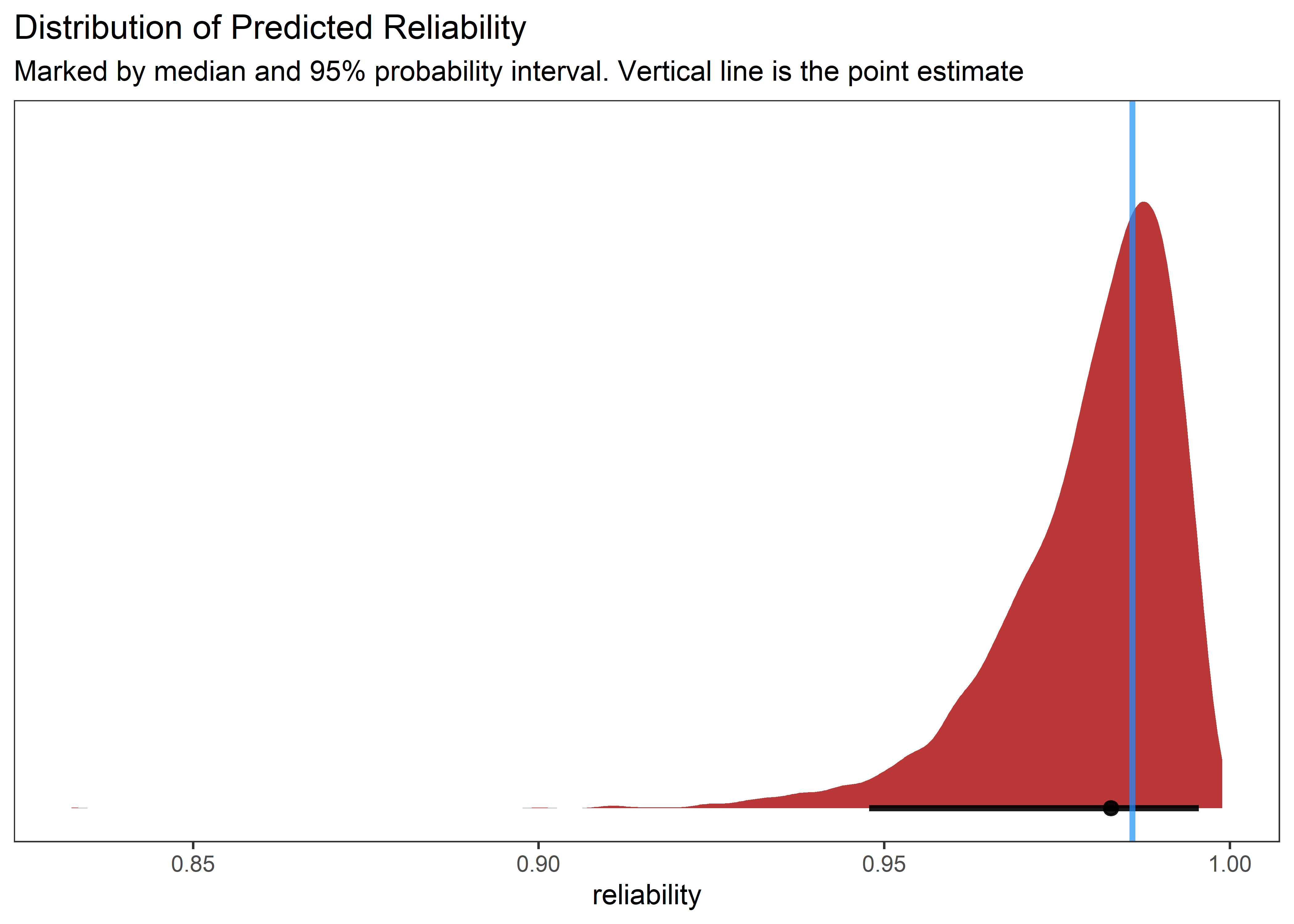
Behold, a full reliability distribution supported by the data! So much better for decision making than the point estimate!
Thank you for reading.
Appendix - Prior Predictive Simulation
Prior Predictive Simulation for Stress-in-Service
set.seed(45)
mu_prior <- rlnorm(100000, meanlog = .5, sdlog = 1)
mu_prior_tbl <- mu_prior %>%
  as_tibble() %>%
  filter(value > 0)

muuuuu <- mu_prior_tbl %>% ggplot(aes(x = mu_prior)) +
  geom_histogram(aes(y = ..density..), fill = "#2c3e50", color = "white", alpha = .6) +
  scale_x_continuous(trans = "log10")

mu_prior_tbl %>%
  mutate(orig = log(value)) %>%
  pull(orig) %>%
  mean()
## [1] 0.5033306mu_prior_tbl %>%
mutate(orig = log(value)) %>%
pull(orig) %>%
sd()## [1] 1.001799set.seed(45)
sigma_prior <- runif(100000, .01, 8)
p0_priors_tbl <- sigma_prior %>%
as_tibble() %>%
bind_cols(mu_prior_tbl) %>%
rename(sigma = value, mu = value1)
sigmaaa <- p0_priors_tbl %>% ggplot(aes(x = sigma_prior)) +
geom_histogram(aes(y = ..density..), fill = "#2c3e50", color = "white", alpha = .6)
muuuuu + sigmaaa + plot_annotation(title = "Prior Predicitve Simulations for mu and sigma")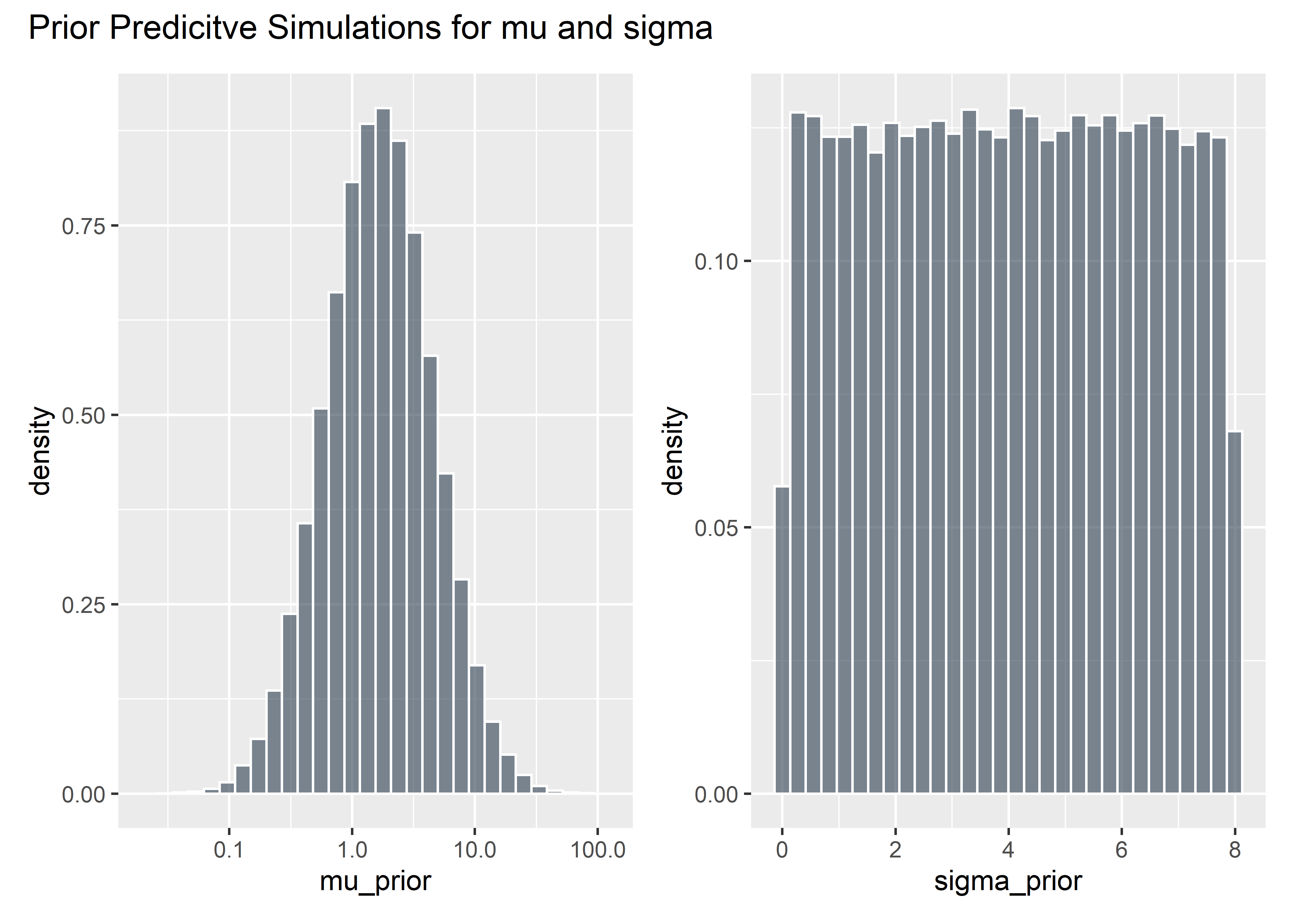
Evaluate implied stress-in-service before seeing the data
p0 <- p0_priors_tbl[1:1000, ] %>%
  mutate(row_id = row_number()) %>%
  mutate(plotted_y_data = pmap(
    list(sigma, mu, row_id),
    ~ tibble(
      x = seq(.1, 100, length.out = 1000),
      y = dlnorm(x, .x, .y),
      z = row_id
    )
  )) %>%
  unnest(plotted_y_data) %>%
  filter(x > 1) %>%
  ggplot(aes(x, y)) +
  geom_line(aes(group = row_id), alpha = .15, color = "#2c3e50") +
  labs(
    x = "Stress-in-Service",
    y = "Density",
    title = "Implied Stress-in-Service Possibilities",
    subtitle = "Generated from Priors Only"
  ) +
  scale_x_continuous(trans = "log10") +
  ylim(c(0, 1))

p0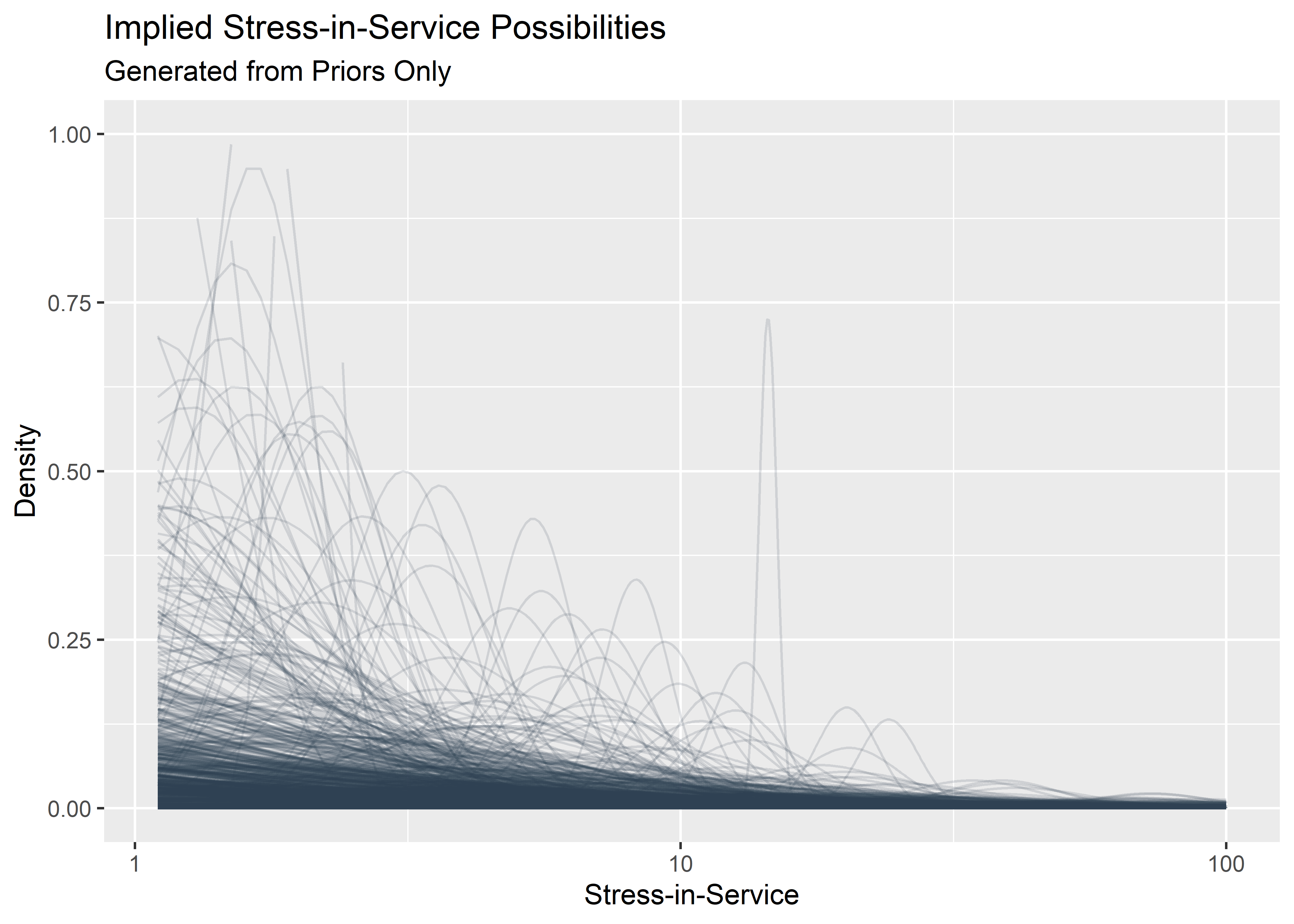
Evaluate implied failure stress before seeing the data:
# seed for reproducibility
set.seed(12)

# Evaluate Mildly Informed Priors
shape_prior <- runif(100000, 0, 10)
shape_prior_tbl <- shape_prior %>% as_tibble()
shaaaape <- shape_prior_tbl %>% ggplot(aes(x = shape_prior)) +
  geom_histogram(aes(y = ..density..), binwidth = 1, boundary = 10, fill = "#2c3e50", color = "white", alpha = .6)


intercept_prior <- rstudent_t(100000, 3, 5, 5)

priors_tbl <- intercept_prior %>%
  as_tibble() %>%
  bind_cols(shape_prior_tbl) %>%
  rename(intercept = value, shape = value1) %>%
  mutate(scale_prior = exp(intercept) / (gamma(1 + 1 / shape))) %>%
  filter(scale_prior < 1000) %>%
  select(-intercept)

scaaaale <- priors_tbl %>% ggplot(aes(x = scale_prior)) +
  geom_histogram(aes(y = ..density..), binwidth = 10, boundary = 100, fill = "#2c3e50", color = "white", alpha = .6) +
  ylim(c(0, .005))

shaaaape + scaaaale + plot_annotation(title = "Prior Predicitve Simulations for Shape and Scale")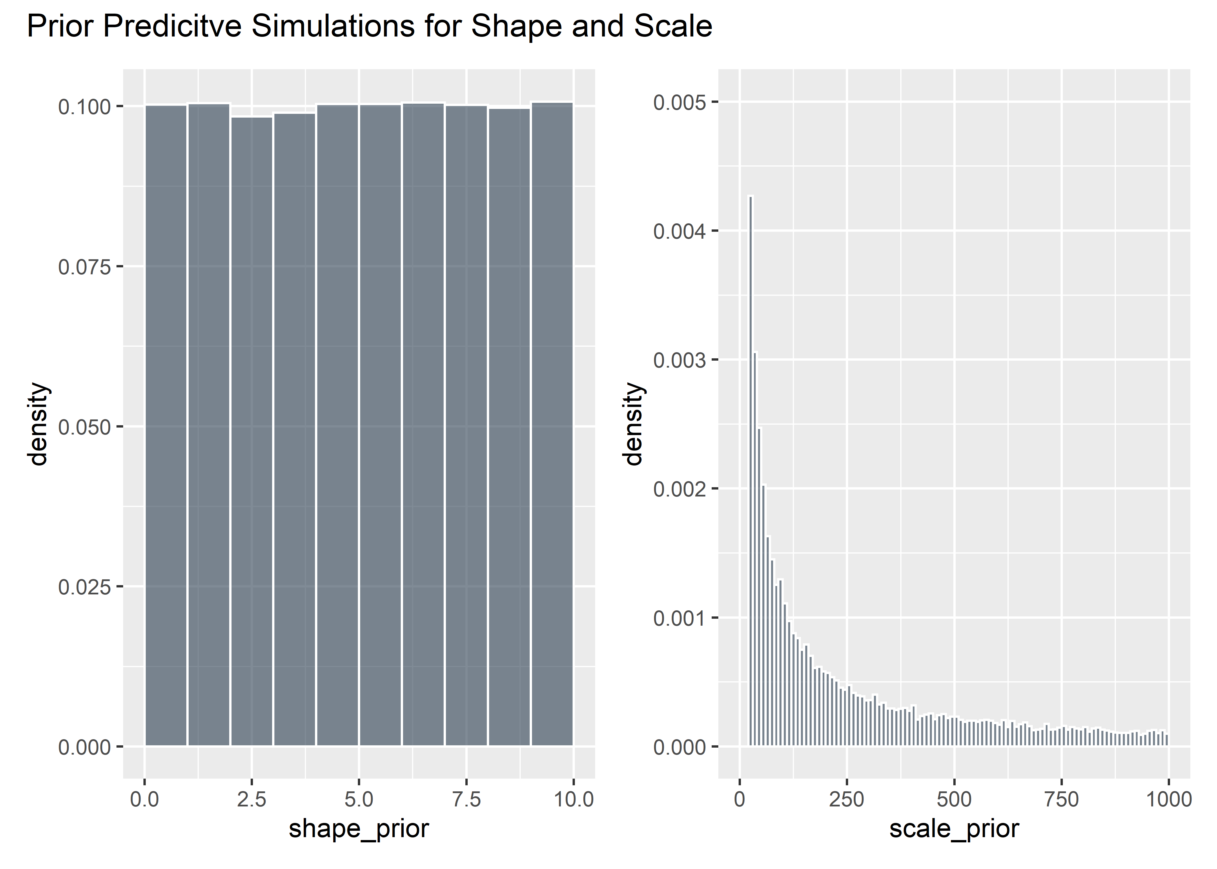
These are the plausible distributions of failure stress we might expect before seeing the data (based on these priors):
p1 <- priors_tbl[1:500, ] %>%
  mutate(plotted_y_data = map2(
    shape, scale_prior,
    ~ tibble(
      x = seq(0, 200, length.out = 400),
      y = dweibull(x, .x, .y)
    )
  )) %>%
  unnest(plotted_y_data) %>%
  ggplot(aes(x, y)) +
  geom_line(aes(group = shape), alpha = .2, color = "#2c3e50") +
  xlim(c(0, 50)) +
  ylim(c(0, .5)) +
  labs(
    x = "Failure Stress Distributions",
    y = "Density",
    title = "Implied Failure Stress Possibilities",
    subtitle = "Generated from Priors Only"
  )

p1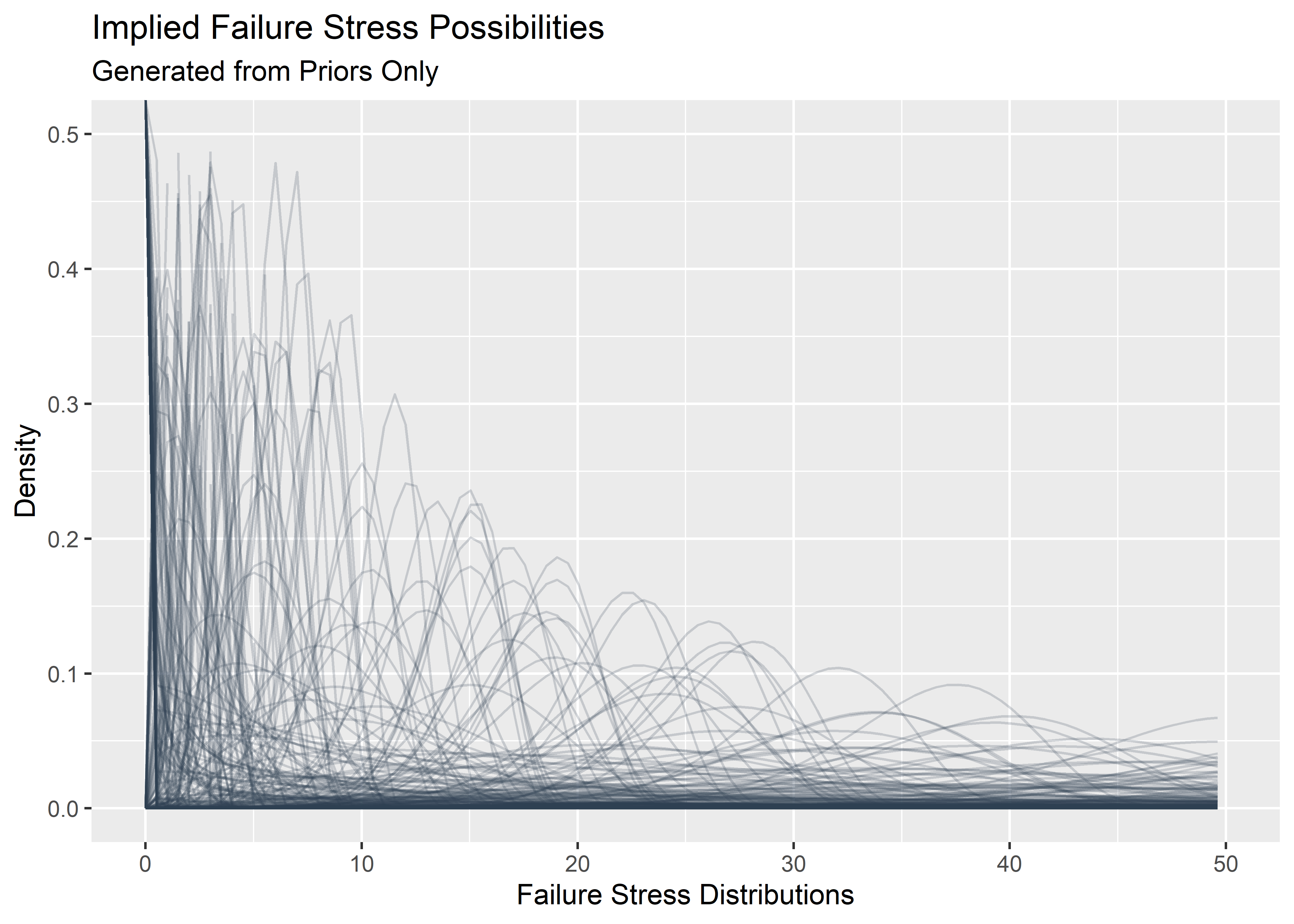
Image from here: https://www.quanterion.com/interference-stressstrength-analysis/↩
If the stress and strength distribution were exactly the same and overlapping, the probability of failures would be 50% since you would be pulling 2 draws randomly and comparing stress to strength↩
Practical Applications of Bayesian Reliability, pg. 170↩